mirror of
https://github.com/alkimake/paperclip.git
synced 2026-06-14 01:50:39 +09:00
 f257530537
## Thinking Path > - Paperclip operators spend most of their time scanning the board, inbox, sidebar, and local dev status surfaces > - Small UI and dev-ops frictions make repeated operator workflows feel slower than they need to be > - The working branch contained several independent quality-of-life improvements mixed with larger cloud work > - Grouping these smaller UI/dev-ops changes together keeps review overhead reasonable without merging them into feature PRs > - This pull request collects the operator-facing QoL polish into one standalone branch > - The benefit is a cleaner board navigation and local dev recovery experience without depending on cloud upstream sync ## What Changed - Relaxed forced 44px touch targets for small inline widgets. - Fixed mobile mention menu scrolling and sidebar spacing on touch/mobile layouts. - Synced inbox hover state with j/k selection. - Moved plugin sidebar entries into the Work section. - Added manual dev-server restart action/banner behavior. - Logged plugin bridge 502 causes for better diagnosis. ## Verification - `pnpm install --frozen-lockfile --ignore-scripts` - `pnpm --filter @paperclipai/plugin-sdk build` - `pnpm exec vitest run ui/src/components/MarkdownEditor.test.tsx ui/src/components/Sidebar.test.tsx ui/src/components/SidebarProjects.test.tsx ui/src/pages/Inbox.test.tsx ui/src/components/DevRestartBanner.test.tsx server/src/__tests__/dev-server-status.test.ts server/src/__tests__/health-dev-server-token.test.ts server/src/__tests__/plugin-routes-authz.test.ts` initially failed only because plugin SDK `dist` was not built in the fresh worktree. - Rerun after build: `pnpm exec vitest run server/src/__tests__/plugin-routes-authz.test.ts` passed. - The remaining targeted UI/dev-server tests passed on the first post-install run. ## Visual Evidence - Sidebar layout and plugin Work section: 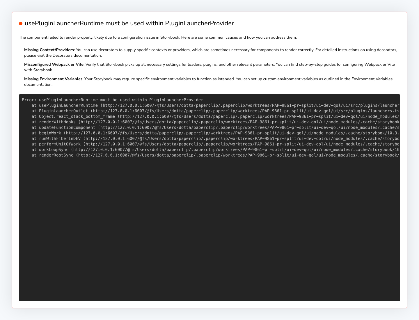 - Inbox/task row selection and hover-state surface: 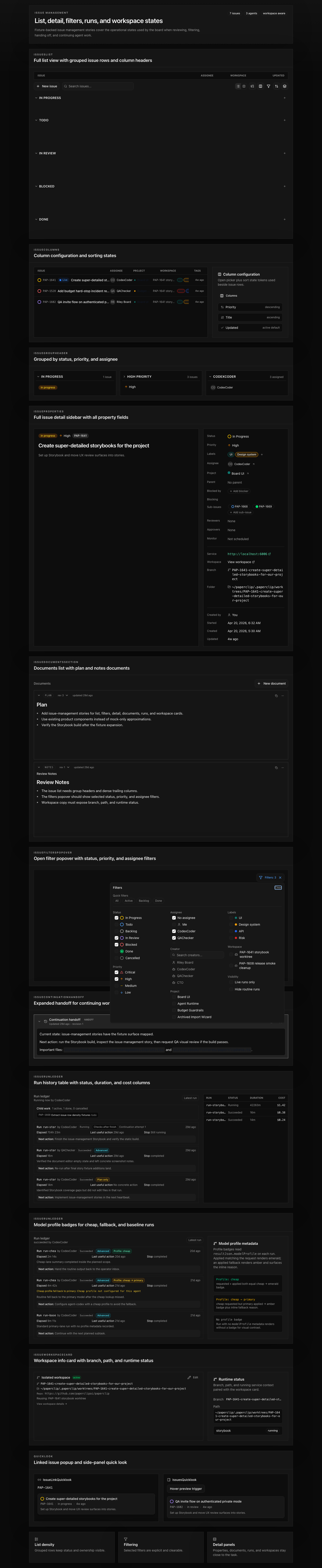 - Dev restart banner desktop: 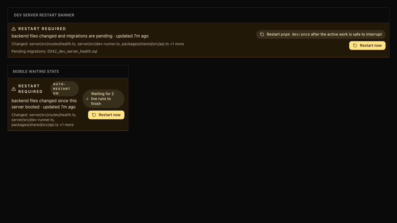 - Dev restart banner mobile: 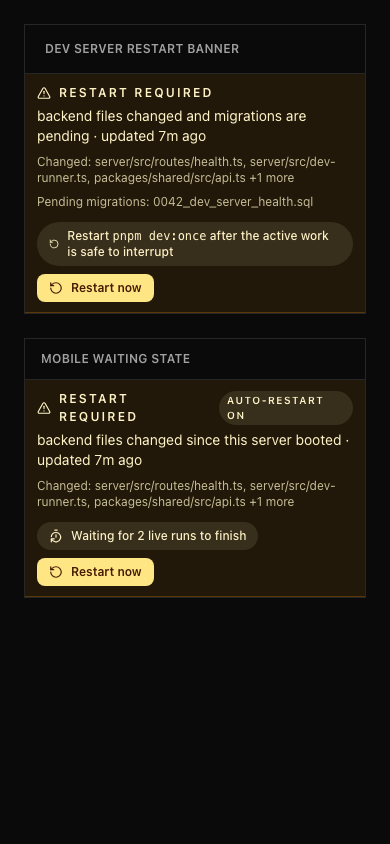 ## Risks - Mostly UI/dev ergonomics with low data risk. - Sidebar and inbox changes touch frequently used navigation surfaces, so visual review on desktop/mobile is still useful. > For core feature work, check [`ROADMAP.md`](ROADMAP.md) first and discuss it in `#dev` before opening the PR. Feature PRs that overlap with planned core work may need to be redirected — check the roadmap first. See `CONTRIBUTING.md`. ## Model Used - OpenAI Codex, GPT-5-based coding agent with local shell/git/tool use. Exact hosted model ID and context-window size are not exposed by the local Paperclip adapter runtime. ## Checklist - [x] I have included a thinking path that traces from project context to this change - [x] I have specified the model used (with version and capability details) - [x] I have checked ROADMAP.md and confirmed this PR does not duplicate planned core work - [x] I have run tests locally and they pass - [x] I have added or updated tests where applicable - [x] If this change affects the UI, I have included before/after screenshots - [x] I have updated relevant documentation to reflect my changes - [x] I have considered and documented any risks above - [x] I will address all Greptile and reviewer comments before requesting merge --------- Co-authored-by: Paperclip <noreply@paperclip.ing>
1025 lines
27 KiB
CSS
1025 lines
27 KiB
CSS
@import "tailwindcss";
|
||
@plugin "@tailwindcss/typography";
|
||
|
||
@custom-variant dark (&:is(.dark *));
|
||
|
||
@theme inline {
|
||
--color-background: var(--background);
|
||
--color-foreground: var(--foreground);
|
||
--color-card: var(--card);
|
||
--color-card-foreground: var(--card-foreground);
|
||
--color-popover: var(--popover);
|
||
--color-popover-foreground: var(--popover-foreground);
|
||
--color-primary: var(--primary);
|
||
--color-primary-foreground: var(--primary-foreground);
|
||
--color-secondary: var(--secondary);
|
||
--color-secondary-foreground: var(--secondary-foreground);
|
||
--color-muted: var(--muted);
|
||
--color-muted-foreground: var(--muted-foreground);
|
||
--color-accent: var(--accent);
|
||
--color-accent-foreground: var(--accent-foreground);
|
||
--color-destructive: var(--destructive);
|
||
--color-destructive-foreground: var(--destructive-foreground);
|
||
--color-border: var(--border);
|
||
--color-input: var(--input);
|
||
--color-ring: var(--ring);
|
||
--color-chart-1: var(--chart-1);
|
||
--color-chart-2: var(--chart-2);
|
||
--color-chart-3: var(--chart-3);
|
||
--color-chart-4: var(--chart-4);
|
||
--color-chart-5: var(--chart-5);
|
||
--color-sidebar: var(--sidebar);
|
||
--color-sidebar-foreground: var(--sidebar-foreground);
|
||
--color-sidebar-primary: var(--sidebar-primary);
|
||
--color-sidebar-primary-foreground: var(--sidebar-primary-foreground);
|
||
--color-sidebar-accent: var(--sidebar-accent);
|
||
--color-sidebar-accent-foreground: var(--sidebar-accent-foreground);
|
||
--color-sidebar-border: var(--sidebar-border);
|
||
--color-sidebar-ring: var(--sidebar-ring);
|
||
--radius-sm: 0.375rem;
|
||
--radius-md: 0.5rem;
|
||
--radius-lg: 0px;
|
||
--radius-xl: 0px;
|
||
}
|
||
|
||
:root {
|
||
color-scheme: light;
|
||
--radius: 0;
|
||
--background: oklch(1 0 0);
|
||
--foreground: oklch(0.145 0 0);
|
||
--card: oklch(1 0 0);
|
||
--card-foreground: oklch(0.145 0 0);
|
||
--popover: oklch(1 0 0);
|
||
--popover-foreground: oklch(0.145 0 0);
|
||
--primary: oklch(0.205 0 0);
|
||
--primary-foreground: oklch(0.985 0 0);
|
||
--secondary: oklch(0.97 0 0);
|
||
--secondary-foreground: oklch(0.205 0 0);
|
||
--muted: oklch(0.97 0 0);
|
||
--muted-foreground: oklch(0.556 0 0);
|
||
--accent: oklch(0.97 0 0);
|
||
--accent-foreground: oklch(0.205 0 0);
|
||
--destructive: oklch(0.577 0.245 27.325);
|
||
--destructive-foreground: oklch(0.577 0.245 27.325);
|
||
--border: oklch(0.922 0 0);
|
||
--input: oklch(0.922 0 0);
|
||
--ring: oklch(0.708 0 0);
|
||
--chart-1: oklch(0.646 0.222 41.116);
|
||
--chart-2: oklch(0.6 0.118 184.704);
|
||
--chart-3: oklch(0.398 0.07 227.392);
|
||
--chart-4: oklch(0.828 0.189 84.429);
|
||
--chart-5: oklch(0.769 0.188 70.08);
|
||
--sidebar: oklch(0.985 0 0);
|
||
--sidebar-foreground: oklch(0.145 0 0);
|
||
--sidebar-primary: oklch(0.205 0 0);
|
||
--sidebar-primary-foreground: oklch(0.985 0 0);
|
||
--sidebar-accent: oklch(0.97 0 0);
|
||
--sidebar-accent-foreground: oklch(0.205 0 0);
|
||
--sidebar-border: oklch(0.922 0 0);
|
||
--sidebar-ring: oklch(0.708 0 0);
|
||
--chip-match-title-bg: oklch(0.97 0.02 265);
|
||
--chip-match-title-fg: oklch(0.4 0.13 265);
|
||
--chip-match-title-border: oklch(0.85 0.05 265);
|
||
--chip-match-comment-bg: oklch(0.97 0.02 145);
|
||
--chip-match-comment-fg: oklch(0.4 0.10 145);
|
||
--chip-match-comment-border: oklch(0.85 0.05 145);
|
||
--chip-match-document-bg: oklch(0.97 0.02 295);
|
||
--chip-match-document-fg: oklch(0.4 0.10 295);
|
||
--chip-match-document-border: oklch(0.85 0.05 295);
|
||
--chip-match-identifier-bg: var(--muted);
|
||
--chip-match-identifier-fg: var(--muted-foreground);
|
||
--chip-match-identifier-border: var(--border);
|
||
}
|
||
|
||
.dark {
|
||
--background: oklch(0.145 0 0);
|
||
--foreground: oklch(0.985 0 0);
|
||
--card: oklch(0.205 0 0);
|
||
--card-foreground: oklch(0.985 0 0);
|
||
--popover: oklch(0.205 0 0);
|
||
--popover-foreground: oklch(0.985 0 0);
|
||
--primary: oklch(0.985 0 0);
|
||
--primary-foreground: oklch(0.205 0 0);
|
||
--secondary: oklch(0.269 0 0);
|
||
--secondary-foreground: oklch(0.985 0 0);
|
||
--muted: oklch(0.269 0 0);
|
||
--muted-foreground: oklch(0.708 0 0);
|
||
--accent: oklch(0.269 0 0);
|
||
--accent-foreground: oklch(0.985 0 0);
|
||
--destructive: oklch(0.637 0.237 25.331);
|
||
--destructive-foreground: oklch(0.985 0 0);
|
||
--border: oklch(0.269 0 0);
|
||
--input: oklch(0.269 0 0);
|
||
--ring: oklch(0.439 0 0);
|
||
--chart-1: oklch(0.488 0.243 264.376);
|
||
--chart-2: oklch(0.696 0.17 162.48);
|
||
--chart-3: oklch(0.769 0.188 70.08);
|
||
--chart-4: oklch(0.627 0.265 303.9);
|
||
--chart-5: oklch(0.645 0.246 16.439);
|
||
--sidebar: oklch(0.145 0 0);
|
||
--sidebar-foreground: oklch(0.985 0 0);
|
||
--sidebar-primary: oklch(0.488 0.243 264.376);
|
||
--sidebar-primary-foreground: oklch(0.985 0 0);
|
||
--sidebar-accent: oklch(0.269 0 0);
|
||
--sidebar-accent-foreground: oklch(0.985 0 0);
|
||
--sidebar-border: oklch(0.269 0 0);
|
||
--sidebar-ring: oklch(0.439 0 0);
|
||
--chip-match-title-bg: oklch(0.27 0.04 265 / 0.5);
|
||
--chip-match-title-fg: oklch(0.78 0.10 265);
|
||
--chip-match-title-border: oklch(0.4 0.06 265);
|
||
--chip-match-comment-bg: oklch(0.27 0.04 145 / 0.5);
|
||
--chip-match-comment-fg: oklch(0.78 0.08 145);
|
||
--chip-match-comment-border: oklch(0.4 0.05 145);
|
||
--chip-match-document-bg: oklch(0.27 0.04 295 / 0.5);
|
||
--chip-match-document-fg: oklch(0.78 0.08 295);
|
||
--chip-match-document-border: oklch(0.4 0.05 295);
|
||
--chip-match-identifier-bg: var(--muted);
|
||
--chip-match-identifier-fg: var(--muted-foreground);
|
||
--chip-match-identifier-border: var(--border);
|
||
}
|
||
|
||
@layer base {
|
||
* {
|
||
@apply border-border;
|
||
}
|
||
html {
|
||
height: 100%;
|
||
-webkit-tap-highlight-color: color-mix(in oklab, var(--foreground) 20%, transparent);
|
||
}
|
||
body {
|
||
@apply bg-background text-foreground antialiased;
|
||
height: 100%;
|
||
overflow: hidden;
|
||
}
|
||
h1,
|
||
h2,
|
||
h3 {
|
||
text-wrap: balance;
|
||
}
|
||
/* Prevent double-tap-to-zoom on interactive elements for mobile */
|
||
a,
|
||
button,
|
||
[role="button"],
|
||
input,
|
||
select,
|
||
textarea,
|
||
label {
|
||
touch-action: manipulation;
|
||
}
|
||
/* Let font-mono (utilities layer) override for monospace editors */
|
||
.paperclip-mdxeditor [class*="_placeholder_"],
|
||
.paperclip-mdxeditor-content {
|
||
font-family: inherit;
|
||
}
|
||
}
|
||
|
||
@media (pointer: coarse) {
|
||
button,
|
||
[role="button"],
|
||
input,
|
||
select,
|
||
textarea,
|
||
[data-slot="select-trigger"] {
|
||
min-height: 44px;
|
||
}
|
||
|
||
/* Small inline widgets keep their design size on touch devices —
|
||
forcing 44px here stretches checkboxes, chip menus, and icon buttons
|
||
that live inside dense rows (sidebar headers, issue rows, filter
|
||
popovers). The surrounding row provides the touch area. */
|
||
[data-slot="toggle"],
|
||
[data-slot="checkbox"],
|
||
[data-slot="icon-button"],
|
||
[data-size="xs"],
|
||
[data-size="icon-xs"],
|
||
[data-size="icon-sm"],
|
||
input[type="checkbox"],
|
||
input[type="radio"] {
|
||
min-height: 0;
|
||
}
|
||
}
|
||
|
||
/* Dark mode scrollbars */
|
||
.dark {
|
||
color-scheme: dark;
|
||
}
|
||
|
||
.dark *::-webkit-scrollbar {
|
||
width: 8px;
|
||
height: 8px;
|
||
}
|
||
|
||
.dark *::-webkit-scrollbar-track {
|
||
background: oklch(0.205 0 0);
|
||
}
|
||
|
||
.dark *::-webkit-scrollbar-thumb {
|
||
background: oklch(0.4 0 0);
|
||
border-radius: 4px;
|
||
}
|
||
|
||
.dark *::-webkit-scrollbar-thumb:hover {
|
||
background: oklch(0.5 0 0);
|
||
}
|
||
|
||
/* Auto-hide scrollbar: thin, stable gutter with the thumb visible only on hover */
|
||
.scrollbar-auto-hide {
|
||
scrollbar-gutter: stable;
|
||
scrollbar-width: thin;
|
||
scrollbar-color: transparent transparent;
|
||
}
|
||
|
||
.scrollbar-auto-hide::-webkit-scrollbar {
|
||
width: 8px !important;
|
||
height: 8px !important;
|
||
background: transparent !important;
|
||
}
|
||
.scrollbar-auto-hide::-webkit-scrollbar-track {
|
||
background: transparent !important;
|
||
}
|
||
.scrollbar-auto-hide::-webkit-scrollbar-thumb {
|
||
background: transparent !important;
|
||
}
|
||
/* Light mode scrollbar on hover */
|
||
.scrollbar-auto-hide:hover {
|
||
scrollbar-color: oklch(0.7 0 0) transparent;
|
||
}
|
||
.scrollbar-auto-hide:hover::-webkit-scrollbar-track {
|
||
background: transparent !important;
|
||
}
|
||
.scrollbar-auto-hide:hover::-webkit-scrollbar-thumb {
|
||
background: oklch(0.7 0 0) !important;
|
||
border-radius: 999px !important;
|
||
}
|
||
.scrollbar-auto-hide:hover::-webkit-scrollbar-thumb:hover {
|
||
background: oklch(0.6 0 0) !important;
|
||
}
|
||
/* Dark mode scrollbar on hover */
|
||
.dark .scrollbar-auto-hide:hover {
|
||
scrollbar-color: oklch(0.4 0 0) transparent;
|
||
}
|
||
.dark .scrollbar-auto-hide:hover::-webkit-scrollbar-track {
|
||
background: transparent !important;
|
||
}
|
||
.dark .scrollbar-auto-hide:hover::-webkit-scrollbar-thumb {
|
||
background: oklch(0.4 0 0) !important;
|
||
}
|
||
.dark .scrollbar-auto-hide:hover::-webkit-scrollbar-thumb:hover {
|
||
background: oklch(0.5 0 0) !important;
|
||
}
|
||
|
||
/* Expandable dialog transition for max-width changes */
|
||
[data-slot="dialog-content"] {
|
||
transition: max-width 200ms cubic-bezier(0.16, 1, 0.3, 1);
|
||
}
|
||
|
||
/* Dashboard activity row entry motion */
|
||
@keyframes dashboard-activity-enter {
|
||
0% {
|
||
opacity: 0;
|
||
transform: translateY(-14px) scale(0.985);
|
||
filter: blur(4px);
|
||
}
|
||
62% {
|
||
opacity: 1;
|
||
transform: translateY(2px) scale(1.002);
|
||
filter: blur(0);
|
||
}
|
||
100% {
|
||
opacity: 1;
|
||
transform: translateY(0) scale(1);
|
||
filter: blur(0);
|
||
}
|
||
}
|
||
|
||
@keyframes dashboard-activity-highlight {
|
||
0% {
|
||
box-shadow: inset 2px 0 0 var(--primary);
|
||
background-color: color-mix(in oklab, var(--accent) 55%, transparent);
|
||
}
|
||
100% {
|
||
box-shadow: inset 0 0 0 transparent;
|
||
background-color: transparent;
|
||
}
|
||
}
|
||
|
||
.activity-row-enter {
|
||
animation:
|
||
dashboard-activity-enter 520ms cubic-bezier(0.16, 1, 0.3, 1),
|
||
dashboard-activity-highlight 920ms cubic-bezier(0.16, 1, 0.3, 1);
|
||
}
|
||
|
||
@media (prefers-reduced-motion: reduce) {
|
||
.activity-row-enter {
|
||
animation: none;
|
||
}
|
||
}
|
||
|
||
/* Chain-of-thought reasoning line ticker animations.
|
||
Pure translate, no opacity — the overflow-hidden container clips.
|
||
Both keyframes share the same easing so the two spans move in lockstep. */
|
||
@keyframes cot-line-slide-in {
|
||
from { transform: translateY(100%); }
|
||
to { transform: translateY(0); }
|
||
}
|
||
|
||
@keyframes cot-line-slide-out {
|
||
from { transform: translateY(0); }
|
||
to { transform: translateY(-100%); }
|
||
}
|
||
|
||
.cot-line-enter {
|
||
animation: cot-line-slide-in 300ms cubic-bezier(0.4, 0, 0.2, 1) both;
|
||
}
|
||
|
||
.cot-line-exit {
|
||
animation: cot-line-slide-out 300ms cubic-bezier(0.4, 0, 0.2, 1) forwards;
|
||
}
|
||
|
||
@media (prefers-reduced-motion: reduce) {
|
||
.cot-line-enter,
|
||
.cot-line-exit {
|
||
animation: none;
|
||
}
|
||
}
|
||
|
||
/* Shimmer text effect for active "Working" state — Cursor-style sweep */
|
||
@keyframes shimmer-text-slide {
|
||
0% { background-position: 100% center; }
|
||
60% { background-position: 0% center; }
|
||
100% { background-position: 0% center; }
|
||
}
|
||
|
||
.shimmer-text {
|
||
--shimmer-base: var(--foreground);
|
||
--shimmer-highlight: color-mix(in oklch, var(--foreground) 35%, transparent);
|
||
background: linear-gradient(
|
||
90deg,
|
||
var(--shimmer-base) 0%,
|
||
var(--shimmer-base) 40%,
|
||
var(--shimmer-highlight) 50%,
|
||
var(--shimmer-base) 60%,
|
||
var(--shimmer-base) 100%
|
||
);
|
||
background-size: 200% 100%;
|
||
-webkit-background-clip: text;
|
||
background-clip: text;
|
||
-webkit-text-fill-color: transparent;
|
||
animation: shimmer-text-slide 2.5s linear infinite;
|
||
}
|
||
|
||
@media (prefers-reduced-motion: reduce) {
|
||
.shimmer-text {
|
||
animation: none;
|
||
-webkit-text-fill-color: unset;
|
||
background: none;
|
||
}
|
||
}
|
||
|
||
/* MDXEditor theme integration */
|
||
.paperclip-mdxeditor-scope,
|
||
.paperclip-mdxeditor {
|
||
--baseBase: var(--background);
|
||
--baseBg: transparent;
|
||
--baseBgSubtle: color-mix(in oklab, var(--accent) 35%, transparent);
|
||
--baseLine: var(--border);
|
||
--baseSolid: var(--muted-foreground);
|
||
--baseSolidHover: var(--foreground);
|
||
--baseText: var(--muted-foreground);
|
||
--baseBorderColor: var(--border);
|
||
--baseBorder: var(--border);
|
||
--baseBorderHover: var(--ring);
|
||
--baseTextContrast: var(--foreground);
|
||
--baseTextContrastMuted: var(--muted-foreground);
|
||
--baseTextEmphasis: var(--foreground);
|
||
--basePageBg: var(--background);
|
||
--baseRadius: var(--radius);
|
||
--baseLineHeight: 1.5;
|
||
--accentBorder: color-mix(in oklab, var(--primary) 35%, var(--border));
|
||
--accentSolid: var(--primary);
|
||
--accentSolidHover: var(--primary);
|
||
--accentLine: color-mix(in oklab, var(--primary) 20%, transparent);
|
||
--accentBg: var(--accent);
|
||
--accentBgHover: color-mix(in oklab, var(--accent) 80%, var(--background));
|
||
--accentBgActive: color-mix(in oklab, var(--accent) 72%, var(--background));
|
||
--accentText: var(--accent-foreground);
|
||
font-family: inherit;
|
||
font-size: 1rem;
|
||
line-height: 1.5;
|
||
color: var(--foreground);
|
||
}
|
||
|
||
@media (min-width: 768px) {
|
||
.paperclip-mdxeditor-scope,
|
||
.paperclip-mdxeditor {
|
||
font-size: 0.875rem;
|
||
}
|
||
}
|
||
|
||
.paperclip-mdxeditor-scope [class*="_iconButton_"],
|
||
.paperclip-mdxeditor [class*="_iconButton_"] {
|
||
color: var(--baseText);
|
||
}
|
||
|
||
.paperclip-mdxeditor-scope [class*="_iconButton_"]:hover,
|
||
.paperclip-mdxeditor [class*="_iconButton_"]:hover {
|
||
color: var(--baseTextContrast);
|
||
}
|
||
|
||
.paperclip-mdxeditor .mdxeditor-root-contenteditable {
|
||
min-height: 2.5rem;
|
||
padding: 0;
|
||
line-height: 1.5;
|
||
}
|
||
|
||
.paperclip-mdxeditor [class*="_contentEditable_"] {
|
||
padding: 0.375rem 0.625rem !important;
|
||
}
|
||
|
||
.paperclip-mdxeditor--borderless [class*="_contentEditable_"] {
|
||
padding: 0 !important;
|
||
}
|
||
|
||
.paperclip-mdxeditor [class*="_placeholder_"] {
|
||
font-size: inherit;
|
||
line-height: 1.5;
|
||
color: var(--muted-foreground);
|
||
}
|
||
|
||
.paperclip-mdxeditor-content {
|
||
font-size: inherit;
|
||
line-height: inherit;
|
||
color: inherit;
|
||
}
|
||
|
||
.paperclip-edit-in-place-content {
|
||
font-size: 0.9375rem;
|
||
line-height: 1.75rem;
|
||
}
|
||
|
||
.paperclip-mdxeditor-content > *:first-child {
|
||
margin-top: 0;
|
||
}
|
||
|
||
.paperclip-mdxeditor-content > *:last-child {
|
||
margin-bottom: 0;
|
||
}
|
||
|
||
.paperclip-mdxeditor-content p {
|
||
margin: 0;
|
||
line-height: inherit;
|
||
}
|
||
|
||
.paperclip-mdxeditor-content p + p {
|
||
margin-top: 1.1em;
|
||
}
|
||
|
||
.paperclip-mdxeditor-content a:not(.paperclip-mention-chip):not(.paperclip-project-mention-chip) {
|
||
color: color-mix(in oklab, var(--foreground) 76%, #0969da 24%);
|
||
text-decoration: underline;
|
||
text-underline-offset: 0.15em;
|
||
cursor: pointer;
|
||
}
|
||
|
||
.dark .paperclip-mdxeditor-content a:not(.paperclip-mention-chip):not(.paperclip-project-mention-chip) {
|
||
color: color-mix(in oklab, var(--foreground) 80%, #58a6ff 20%);
|
||
}
|
||
|
||
.paperclip-mdxeditor-content a.paperclip-mention-chip,
|
||
.paperclip-mdxeditor-content a.paperclip-project-mention-chip {
|
||
display: inline-flex;
|
||
align-items: center;
|
||
gap: 0.25rem;
|
||
margin: 0 0.1rem;
|
||
padding: 0 0.625rem;
|
||
border: 1px solid var(--border);
|
||
border-radius: 999px;
|
||
font-size: 0.75rem;
|
||
line-height: 1.25;
|
||
text-decoration: none;
|
||
vertical-align: middle;
|
||
position: relative;
|
||
top: -1px;
|
||
white-space: nowrap;
|
||
user-select: none;
|
||
}
|
||
|
||
/* Strip the MDXEditor's default inline-code styling from the text inside chips
|
||
(the link label otherwise picks up a monospace font + gray tint). */
|
||
.paperclip-mdxeditor-content a.paperclip-mention-chip code,
|
||
.paperclip-mdxeditor-content a.paperclip-project-mention-chip code {
|
||
font-family: inherit;
|
||
background: none;
|
||
color: inherit;
|
||
padding: 0;
|
||
}
|
||
|
||
.paperclip-mdxeditor-content a.paperclip-mention-chip::before,
|
||
a.paperclip-mention-chip::before {
|
||
content: "";
|
||
flex: none;
|
||
}
|
||
|
||
.paperclip-mdxeditor-content a.paperclip-mention-chip[data-mention-kind="project"]::before,
|
||
a.paperclip-mention-chip[data-mention-kind="project"]::before {
|
||
width: 0.45rem;
|
||
height: 0.45rem;
|
||
border-radius: 999px;
|
||
background-color: var(--paperclip-mention-project-color, currentColor);
|
||
}
|
||
|
||
.paperclip-mdxeditor-content a.paperclip-mention-chip[data-mention-kind="agent"]::before,
|
||
a.paperclip-mention-chip[data-mention-kind="agent"]::before {
|
||
width: 0.75rem;
|
||
height: 0.75rem;
|
||
background-color: currentColor;
|
||
-webkit-mask-image: var(--paperclip-mention-icon-mask);
|
||
mask-image: var(--paperclip-mention-icon-mask);
|
||
-webkit-mask-position: center;
|
||
mask-position: center;
|
||
-webkit-mask-repeat: no-repeat;
|
||
mask-repeat: no-repeat;
|
||
-webkit-mask-size: contain;
|
||
mask-size: contain;
|
||
}
|
||
|
||
.paperclip-mdxeditor-content ul,
|
||
.paperclip-mdxeditor-content ol {
|
||
margin: 1.1em 0;
|
||
padding-left: 1.6em;
|
||
}
|
||
|
||
.paperclip-mdxeditor-content ul {
|
||
list-style: disc;
|
||
}
|
||
|
||
.paperclip-mdxeditor-content ol {
|
||
list-style: decimal;
|
||
}
|
||
|
||
.paperclip-mdxeditor-content li {
|
||
display: list-item;
|
||
margin: 0.3em 0;
|
||
line-height: inherit;
|
||
}
|
||
|
||
.paperclip-mdxeditor-content li::marker {
|
||
color: var(--muted-foreground);
|
||
}
|
||
|
||
.paperclip-mdxeditor-content h1 {
|
||
margin: 1.4em 0 0.9em;
|
||
font-size: 1.75em;
|
||
font-weight: 700;
|
||
line-height: 1.2;
|
||
}
|
||
|
||
.paperclip-mdxeditor-content h2 {
|
||
margin: 1.3em 0 0.85em;
|
||
font-size: 1.35em;
|
||
font-weight: 700;
|
||
line-height: 1.3;
|
||
}
|
||
|
||
.paperclip-mdxeditor-content h3 {
|
||
margin: 1.2em 0 0.8em;
|
||
font-size: 1.15em;
|
||
font-weight: 600;
|
||
line-height: 1.35;
|
||
}
|
||
|
||
.paperclip-mdxeditor-content img {
|
||
max-height: 18rem;
|
||
border-radius: calc(var(--radius) - 2px);
|
||
}
|
||
|
||
.paperclip-mdxeditor-content blockquote {
|
||
margin: 1.2em 0;
|
||
padding-left: 1em;
|
||
border-left: 3px solid var(--border);
|
||
color: var(--muted-foreground);
|
||
line-height: inherit;
|
||
}
|
||
|
||
.paperclip-mdxeditor-content code {
|
||
font-family: ui-monospace, SFMono-Regular, Menlo, Monaco, Consolas, "Liberation Mono", "Courier New", monospace;
|
||
font-size: 1em;
|
||
}
|
||
|
||
.paperclip-mdxeditor-content pre {
|
||
margin: 0.4rem 0;
|
||
padding: 0;
|
||
border: 1px solid color-mix(in oklab, var(--foreground) 12%, transparent);
|
||
border-radius: calc(var(--radius) - 3px);
|
||
background: #1e1e2e;
|
||
color: #cdd6f4;
|
||
overflow-x: auto;
|
||
}
|
||
|
||
/* Dark theme for CodeMirror code blocks inside the MDXEditor.
|
||
Overrides the default cm6-theme-basic-light that MDXEditor bundles. */
|
||
.paperclip-mdxeditor .cm-editor {
|
||
background-color: #1e1e2e !important;
|
||
color: #cdd6f4 !important;
|
||
font-size: 1em;
|
||
}
|
||
|
||
.paperclip-mdxeditor .cm-gutters {
|
||
background-color: #181825 !important;
|
||
color: #585b70 !important;
|
||
border-right: 1px solid #313244 !important;
|
||
}
|
||
|
||
.paperclip-mdxeditor .cm-activeLineGutter {
|
||
background-color: #1e1e2e !important;
|
||
}
|
||
|
||
.paperclip-mdxeditor .cm-activeLine {
|
||
background-color: color-mix(in oklab, #cdd6f4 5%, transparent) !important;
|
||
}
|
||
|
||
.paperclip-mdxeditor .cm-cursor,
|
||
.paperclip-mdxeditor .cm-dropCursor {
|
||
border-left-color: #cdd6f4 !important;
|
||
}
|
||
|
||
.paperclip-mdxeditor .cm-selectionBackground {
|
||
background-color: color-mix(in oklab, #89b4fa 25%, transparent) !important;
|
||
}
|
||
|
||
.paperclip-mdxeditor .cm-focused .cm-selectionBackground {
|
||
background-color: color-mix(in oklab, #89b4fa 30%, transparent) !important;
|
||
}
|
||
|
||
.paperclip-mdxeditor .cm-content {
|
||
caret-color: #cdd6f4;
|
||
}
|
||
|
||
/* MDXEditor code block language selector – show on hover only */
|
||
.paperclip-mdxeditor-content [class*="_codeMirrorWrapper_"] {
|
||
position: relative;
|
||
}
|
||
|
||
.paperclip-mdxeditor-content [class*="_codeMirrorToolbar_"],
|
||
.paperclip-mdxeditor-content [class*="_codeBlockToolbar_"] {
|
||
position: absolute;
|
||
top: 0.25rem;
|
||
right: 0.25rem;
|
||
z-index: 2;
|
||
opacity: 0;
|
||
transition: opacity 150ms ease;
|
||
}
|
||
|
||
.paperclip-mdxeditor-content [class*="_codeMirrorToolbar_"] select,
|
||
.paperclip-mdxeditor-content [class*="_codeBlockToolbar_"] select {
|
||
background-color: #313244;
|
||
color: #cdd6f4;
|
||
border-color: #45475a;
|
||
}
|
||
|
||
.paperclip-mdxeditor-content [class*="_codeMirrorWrapper_"]:hover [class*="_codeMirrorToolbar_"],
|
||
.paperclip-mdxeditor-content [class*="_codeMirrorWrapper_"]:hover [class*="_codeBlockToolbar_"],
|
||
.paperclip-mdxeditor-content [class*="_codeMirrorWrapper_"]:focus-within [class*="_codeMirrorToolbar_"],
|
||
.paperclip-mdxeditor-content [class*="_codeMirrorWrapper_"]:focus-within [class*="_codeBlockToolbar_"] {
|
||
opacity: 1;
|
||
}
|
||
|
||
/* Rendered markdown code blocks & inline code (prose/MarkdownBody context).
|
||
Dark theme code blocks with compact sizing.
|
||
Override prose CSS variables so prose-invert can't revert to defaults. */
|
||
.paperclip-markdown {
|
||
--tw-prose-pre-bg: #1e1e2e;
|
||
--tw-prose-pre-code: #cdd6f4;
|
||
--tw-prose-invert-pre-bg: #1e1e2e;
|
||
--tw-prose-invert-pre-code: #cdd6f4;
|
||
}
|
||
|
||
.paperclip-markdown pre {
|
||
border: 1px solid color-mix(in oklab, var(--foreground) 12%, transparent) !important;
|
||
border-radius: calc(var(--radius) - 3px) !important;
|
||
background-color: #1e1e2e !important;
|
||
color: #cdd6f4 !important;
|
||
padding: 0.5rem 0.65rem !important;
|
||
margin: 0.4rem 0 !important;
|
||
font-size: 1em !important;
|
||
overflow-x: auto;
|
||
white-space: pre;
|
||
}
|
||
|
||
.paperclip-markdown code {
|
||
font-family: ui-monospace, SFMono-Regular, Menlo, Monaco, Consolas, "Liberation Mono", "Courier New", monospace;
|
||
font-size: 1em;
|
||
}
|
||
|
||
.paperclip-markdown pre code {
|
||
font-size: inherit;
|
||
color: inherit;
|
||
background: none;
|
||
}
|
||
|
||
/* Copy-to-clipboard button on fenced code blocks */
|
||
.paperclip-markdown-codeblock {
|
||
position: relative;
|
||
}
|
||
|
||
.paperclip-markdown-codeblock-copy {
|
||
position: absolute;
|
||
top: 0.4rem;
|
||
right: 0.4rem;
|
||
display: inline-flex;
|
||
align-items: center;
|
||
gap: 0.25rem;
|
||
padding: 0.2rem 0.4rem;
|
||
border-radius: calc(var(--radius) - 4px);
|
||
border: 1px solid color-mix(in oklab, var(--foreground) 14%, transparent);
|
||
background-color: color-mix(in oklab, var(--muted) 92%, var(--background) 8%);
|
||
color: var(--muted-foreground);
|
||
font-size: 0.7rem;
|
||
line-height: 1;
|
||
cursor: pointer;
|
||
opacity: 0;
|
||
transition: opacity 0.12s ease, background-color 0.12s ease, color 0.12s ease;
|
||
}
|
||
|
||
.paperclip-markdown-codeblock:hover .paperclip-markdown-codeblock-copy,
|
||
.paperclip-markdown-codeblock-copy:focus-visible,
|
||
.paperclip-markdown-codeblock-copy[data-copied] {
|
||
opacity: 1;
|
||
}
|
||
|
||
.paperclip-markdown-codeblock-copy:hover {
|
||
background-color: var(--accent);
|
||
color: var(--accent-foreground);
|
||
}
|
||
|
||
.paperclip-markdown-codeblock-copy[data-copied] {
|
||
color: var(--primary);
|
||
}
|
||
|
||
.paperclip-markdown-codeblock-copy[data-failed] {
|
||
color: var(--destructive);
|
||
}
|
||
|
||
.paperclip-markdown-codeblock-copy-label {
|
||
font-weight: 500;
|
||
}
|
||
|
||
/* Remove backtick pseudo-elements from inline code (prose default adds them) */
|
||
.prose code::before,
|
||
.prose code::after {
|
||
content: none;
|
||
}
|
||
|
||
/* Inline code background (not inside a code block) */
|
||
.prose :not(pre) > code {
|
||
background-color: color-mix(in oklab, var(--accent) 60%, transparent);
|
||
padding: 0.15em 0.35em;
|
||
border-radius: 3px;
|
||
font-weight: 500;
|
||
}
|
||
|
||
.dark .prose :not(pre) > code {
|
||
background-color: #ffffff0f;
|
||
}
|
||
|
||
.paperclip-markdown {
|
||
color: var(--foreground);
|
||
font-size: 0.9375rem;
|
||
line-height: 1.6;
|
||
}
|
||
|
||
.paperclip-markdown > :first-child {
|
||
margin-top: 0;
|
||
}
|
||
|
||
.paperclip-markdown > :last-child {
|
||
margin-bottom: 0;
|
||
}
|
||
|
||
.paperclip-markdown :where(p, ul, ol, blockquote, pre, .paperclip-markdown-table-scroll) {
|
||
margin-top: 0.7rem;
|
||
margin-bottom: 0.7rem;
|
||
}
|
||
|
||
.paperclip-markdown :where(ul, ol) {
|
||
padding-left: 1.15rem;
|
||
}
|
||
|
||
.paperclip-markdown ul {
|
||
list-style-type: disc;
|
||
}
|
||
|
||
.paperclip-markdown ol {
|
||
list-style-type: decimal;
|
||
}
|
||
|
||
.paperclip-markdown li {
|
||
margin: 0.14rem 0;
|
||
padding-left: 0.2rem;
|
||
}
|
||
|
||
.paperclip-markdown li > :where(p, ul, ol) {
|
||
margin-top: 0.3rem;
|
||
margin-bottom: 0.3rem;
|
||
}
|
||
|
||
.paperclip-markdown li::marker {
|
||
color: var(--muted-foreground);
|
||
}
|
||
|
||
.paperclip-markdown h1,
|
||
.paperclip-markdown h2,
|
||
.paperclip-markdown h3,
|
||
.paperclip-markdown h4 {
|
||
margin-top: 1.75rem;
|
||
margin-bottom: 0.45rem;
|
||
color: var(--foreground);
|
||
font-weight: 600;
|
||
letter-spacing: -0.01em;
|
||
line-height: 1.3;
|
||
}
|
||
|
||
.paperclip-markdown h1 {
|
||
font-size: 1.5rem;
|
||
}
|
||
|
||
.paperclip-markdown h2 {
|
||
font-size: 1.25rem;
|
||
}
|
||
|
||
.paperclip-markdown h3 {
|
||
font-size: 1.05rem;
|
||
}
|
||
|
||
.paperclip-markdown h4 {
|
||
font-size: 0.95rem;
|
||
}
|
||
|
||
.paperclip-markdown :where(strong, b) {
|
||
color: var(--foreground);
|
||
font-weight: 600;
|
||
}
|
||
|
||
.paperclip-markdown a {
|
||
color: color-mix(in oklab, var(--foreground) 76%, #0969da 24%);
|
||
text-decoration: underline;
|
||
text-underline-offset: 0.15em;
|
||
cursor: pointer;
|
||
}
|
||
|
||
.paperclip-markdown a.paperclip-mention-chip {
|
||
text-decoration: none;
|
||
}
|
||
|
||
.paperclip-markdown a.paperclip-mention-chip[data-mention-kind="issue"] {
|
||
border-color: color-mix(in oklab, var(--foreground) 14%, var(--border) 86%);
|
||
background: color-mix(in oklab, var(--accent) 42%, transparent);
|
||
}
|
||
|
||
/* Inline issue references in markdown: no pill chrome, just a status icon
|
||
beside the link label — keeps the pair from splitting across lines. */
|
||
.paperclip-markdown-issue-ref {
|
||
display: inline;
|
||
white-space: nowrap;
|
||
}
|
||
|
||
.dark .paperclip-markdown a {
|
||
color: color-mix(in oklab, var(--foreground) 80%, #58a6ff 20%);
|
||
}
|
||
|
||
.paperclip-markdown blockquote {
|
||
margin-left: 0;
|
||
padding-left: 0.95rem;
|
||
border-left: 0.24rem solid color-mix(in oklab, var(--border) 84%, var(--muted-foreground) 16%);
|
||
color: var(--muted-foreground);
|
||
}
|
||
|
||
.paperclip-markdown hr {
|
||
margin: 1.25rem 0;
|
||
border-color: var(--border);
|
||
}
|
||
|
||
.paperclip-markdown img {
|
||
border-radius: calc(var(--radius) + 2px);
|
||
box-shadow: inset 0 0 0 1px color-mix(in oklab, var(--foreground) 10%, transparent);
|
||
}
|
||
|
||
.paperclip-markdown-table-scroll {
|
||
max-width: 100%;
|
||
overflow-x: auto;
|
||
overscroll-behavior-x: contain;
|
||
-webkit-overflow-scrolling: touch;
|
||
}
|
||
|
||
.paperclip-markdown-table-scroll:focus-visible {
|
||
outline: 2px solid var(--ring);
|
||
outline-offset: 2px;
|
||
}
|
||
|
||
.paperclip-markdown-table-scroll table {
|
||
width: max-content;
|
||
min-width: 100%;
|
||
margin: 0;
|
||
}
|
||
|
||
.paperclip-markdown-table-scroll :where(th, td) {
|
||
min-width: 8rem;
|
||
max-width: 18rem;
|
||
vertical-align: top;
|
||
}
|
||
|
||
.paperclip-markdown th {
|
||
font-weight: 600;
|
||
text-align: left;
|
||
}
|
||
|
||
.paperclip-mermaid {
|
||
margin: 0.5rem 0;
|
||
padding: 0.45rem 0.55rem;
|
||
border: 1px solid var(--border);
|
||
border-radius: calc(var(--radius) - 3px);
|
||
background-color: color-mix(in oklab, var(--accent) 35%, transparent);
|
||
overflow-x: auto;
|
||
}
|
||
|
||
.paperclip-mermaid svg {
|
||
display: block;
|
||
width: max-content;
|
||
max-width: none;
|
||
min-width: 100%;
|
||
height: auto;
|
||
}
|
||
|
||
.paperclip-mermaid-status {
|
||
margin: 0 0 0.45rem;
|
||
font-size: 0.75rem;
|
||
color: var(--muted-foreground);
|
||
}
|
||
|
||
.paperclip-mermaid-status-error {
|
||
color: var(--destructive);
|
||
}
|
||
|
||
.paperclip-mermaid-source {
|
||
margin: 0;
|
||
padding: 0;
|
||
border: 0;
|
||
background: transparent;
|
||
}
|
||
|
||
/* Mention chips rendered inline in prose (MarkdownBody or inline anchors) */
|
||
a.paperclip-mention-chip,
|
||
a.paperclip-project-mention-chip,
|
||
span.paperclip-mention-chip,
|
||
span.paperclip-project-mention-chip {
|
||
display: inline-flex;
|
||
align-items: center;
|
||
gap: 0.25rem;
|
||
margin: 0 0.1rem;
|
||
padding: 0 0.625rem;
|
||
border: 1px solid var(--border);
|
||
border-radius: 999px;
|
||
font-size: 0.75rem;
|
||
line-height: 1.25;
|
||
text-decoration: none;
|
||
/* Center the pill on the surrounding x-height so it sits on the text line
|
||
instead of hanging below it. inline-flex baseline alignment is unreliable
|
||
across browsers, so use vertical-align: middle for a predictable result.
|
||
Nudge up 1px so it visually centers with the cap height of the text. */
|
||
vertical-align: middle;
|
||
position: relative;
|
||
top: -1px;
|
||
white-space: nowrap;
|
||
}
|
||
|
||
/* When the identifier inside a chip is backtick-wrapped in markdown, strip the
|
||
inline-code monospace/gray styling so the pill label reads cleanly. */
|
||
.paperclip-markdown a.paperclip-mention-chip code,
|
||
.paperclip-markdown a.paperclip-project-mention-chip code,
|
||
.paperclip-markdown span.paperclip-mention-chip code,
|
||
.paperclip-markdown span.paperclip-project-mention-chip code {
|
||
font-family: inherit;
|
||
background: none;
|
||
color: inherit;
|
||
padding: 0;
|
||
font-size: inherit;
|
||
}
|
||
|
||
/* Keep MDXEditor popups above app dialogs, even when they portal to <body>. */
|
||
[class*="_popupContainer_"] {
|
||
z-index: 81 !important;
|
||
}
|
||
|
||
[class*="_dialogOverlay_"] {
|
||
z-index: 80;
|
||
}
|
||
|
||
[class*="_dialogContent_"],
|
||
[class*="_largeDialogContent_"],
|
||
[class*="_popoverContent_"],
|
||
[class*="_linkDialogPopoverContent_"],
|
||
[class*="_tableColumnEditorPopoverContent_"],
|
||
[class*="_toolbarButtonDropdownContainer_"],
|
||
[class*="_toolbarNodeKindSelectContainer_"] {
|
||
z-index: 81 !important;
|
||
}
|